5 years ago in Brand • 12 min read
How Colour Psychology Impacts Your Brand
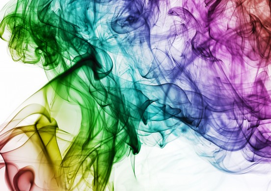
Many elements go into the construction of a complete brand identity, with one of the most striking being your choice of colour. Discover the psychology behind this decision.
When we talk about what makes a brand, it goes far beyond your logo.
Your brand is what sets you apart from you and your competitors. It’s the promise, identity and purpose your audience connects with that tells them what your organisation is all about.
This brand exists in every aspect of your marketing. Whether it’s on your website, your business cards, a new brochure or your latest Facebook post, your brand message should be clear and consistent throughout, as this forms the lasting link to your audience, as well as creates a sense of community and familiarity for your staff.
Many elements go into the construction of a complete, coherent brand identity, with one of the most striking being your choice of colour. This is not a decision to be taken lightly, or one that should be made on your own personal preferences. Your choice of colour makes a major statement about your brand’s personality, and what people’s first impression of your organisation is.
A lot of comprehensive has been done into the power of colour psychology, and we recommend doing some digging as it’s a fascinating topic for designers, marketers and casual readers. But if you’re looking for an immediate idea of how different colours impact people to help create a new brand or revamp your existing one, here’s our quick breakdown of colour marketing psychology.
What Your Choice of Colour Says About Your Brand
Red

Red is a powerful, dynamic colour that’s effective a capturing an audience’s attention immediately. As the most intense colour across the spectrum, it evokes intense emotions like passion, love, excitement and courage. If your brand is looking to grab attention quickly, red is an ideal colour to choose, especially if you offer a product or service that appeals to their emotions.
However, with every colour there are positives and negatives to consider. For instance, red is a colour closely associated with danger, aggression and pain. These negative associations can be problematic, which is why it can be preferable to use red sparingly in your branding to signify special offers or call-to-action buttons.
5 Famously Red Brands:
- Coca-Cola
- YouTube
- Kellogg’s
- Virgin
- Vodafone
Blue
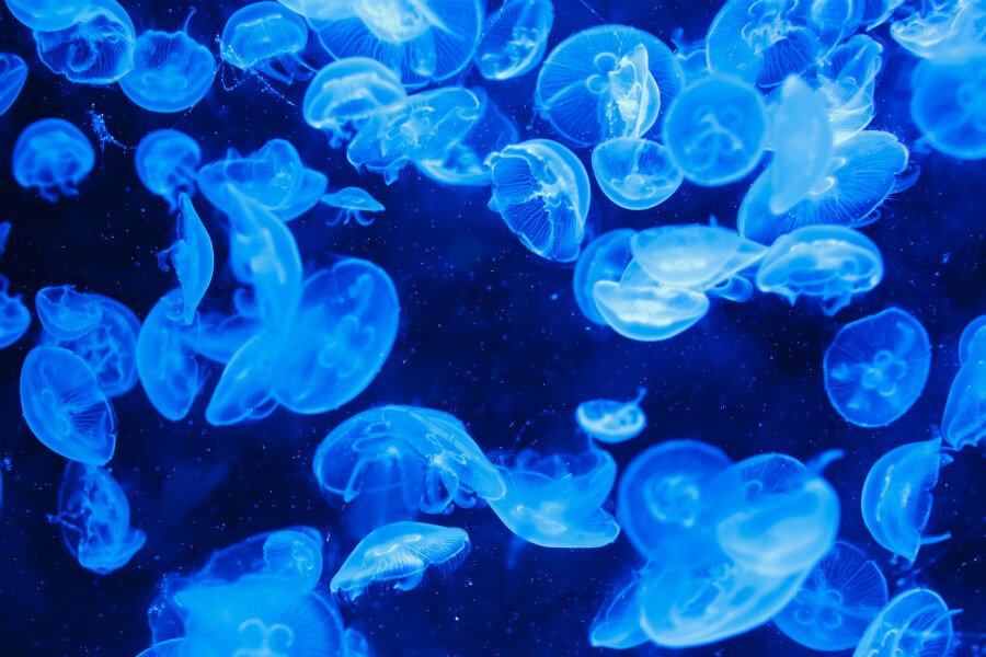
Blue is one of the most commonly used colours for brands, with good reason. The colour is a beacon of trust, dependability and responsibility, traits that practically all companies want to present to their audience. Also, conversely to red, blue presents a soothing, logical tone, suggesting the offering is a more secure, guaranteed bet than the more impactful colours.
Nevertheless, blue has its downsides, namely its capacity to present a brand’s nature as cold and detached. It’s also a colour that’s closely associated with sadness and depression, so if used ineffectively it can lead people to feel distant from your brand. Despite these drawbacks, blue has become a go-to colour for professional groups.
5 Famously Blue Brands:
- Ford
- Intel
- VISA
- Skype
Yellow
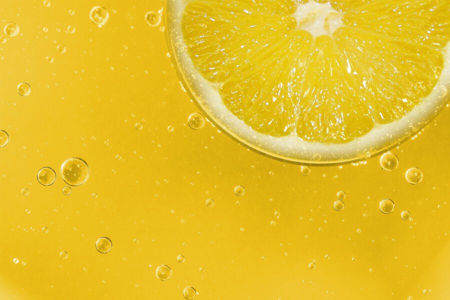
Interestingly, yellow is the colour we first respond to as babies, and is the easiest colour for our eyes to see. This makes it very attention-grabbing for brands, which is why it’s often used as the colour for special offers on a website or other marketing collateral. In addition, with its links to sunshine, yellow is associated with joy, happiness, optimism and motivation. This makes it powerful when advertising to younger audiences or making your audience feel positive.
On the reverse side, yellow might be the first colour we respond to, it’s also the most difficult to take in. Due to its attention-grabbing nature, yellow is a staple colour for warning and danger signs, which lead people to associate it with caution and fear. As a result yellow is one of the least-used colours among major brands, but for the right message it can present a very warm, inviting option.
5 Famously Yellow Brands:
- McDonald's
- Shell Oil
- Ferrari
- IKEA
- Hertz
Green

Green is the easiest colour on the eye, making it a great choice for brands looking to relax their audience and present a calm, reassuring tone. There are two standout industries where green is used in branding – environmental and healthcare organisations. The association with nature and growth is clear to see, while its links to correcting and making things better connect green with many healthcare and fitness providers.
It does carry some negative associations, such as envy, boredom and greed. The last of these is due to green’s relationship with money, which can lead people to link brands with materialistic tendencies. Overall though, green offers arguably the biggest swing of positive over negative attributes, but only if it’s traits suit your brand message.
5 Famously Green Brands:
- Starbucks
- Heineken
- John Deere
- Android
- Land Rover
Orange
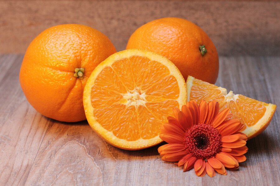
Sitting between red and yellow, orange offers almost a best of both worlds blend of excitement and energy with joy and cheeriness. Orange has also over time become linked with brands wishing to demonstrate a creative, innovative spirit, while it also presents a comforting, warm characteristic. Plus, you can’t forget that it’s the colour of Halloween.
Orange is considered one of the most positive colours brands can use, adding a sense of fun and freedom. However, this often makes it ill-fitting for brands looking to present a more serious, professional tone. Orange has also shown to evoke feelings of immaturity, laziness and frivolity, so it should be used with caution to present a brand’s lively personality, but not depict them as flippant or superficial.
5 Famously Orange Brands:
- Fanta
- Amazon
- Nickelodeon
- Penguin
- orange (of course)
Purple

Historically, purple has been used as a royal colour, signifying luxury, quality and prestige. However, it is also a colour closely associated with wisdom, spirituality and imagination. It’s a colour many brands use to add an air of sophistication and quality to their offering, signifying to their audience that they present a deeper, stronger level of service in comparison to others in their field.
But, due to these links with luxury, an overuse of purple can be viewed as a symbol of arrogance and extravagance. This can result in audiences feeling alienated by a brand rather than viewing it as a step up in quality, or that the step-up in quality makes it inaccessible. Therefore it feels more fitting to use purple as an accent rather than the central focus of your branding.
5 Famously Purple Brands:
- Yahoo
- FedEx
- Cadbury
- Premier Inn
- Hallmark
Pink/Magenta
Pink has often been used by brands appealing to a predominantly female audience, as it imparts feelings of femininity, playfulness and love. As a result, this colour is commonplace in branding for girls’ toys, make-up and other accessories, reducing the intensity of red and making it more a symbol of unconditional love and kindness.
Of course, pink does not have the same bold visual impact that red offers, and can present feelings of weakness or immaturity if used in ineffectively. But, due to its overwhelming employment by brands appealing to a female audience, it can be considered a safe bet if your brand is geared to this gender.
5 Famously Pink Brands:
- Barbie
- Hello Kitty
- T-Mobile
- Cosmopolitan
- Victoria’s Secret
Brown

Brown presents an image that a brand is sturdy, reliable and serious. While it’s undoubtedly not the most stimulating colour to build a brand around, it offers a grounded sense of security and protection to audiences where more vibrant colours could be viewed as too playful or light-hearted for your brand’s offering. Plus, as the colour of chocolate and coffee, it is also commonly employed by these companies for quick association.
However, that serious, secure tone can also present a brand as reserved, bland and strait-laced if relied on too heavily. Especially in this age where customers like to feel closely connected to the people behind the business, it is uncommon to see brown employed as the primary colour in an organisation’s branding.
5 Famously Brown Brands:
- UPS
- Hershey
- Jack Daniels
- Magnum
- M&M
Black & White

The colours at both ends of the spectrum, branding that focuses substantially on black and white convey a message that they’re sophisticated, clean and authoritative. The high legibility presents brands that use this as straightforward to digest, and the lack of colour can illustrate to audiences that this brand doesn’t need gimmicks or vibrant displays – the quality of their offering speaks volumes.
Of course, the simplicity and starkness offered by black, white and their various shades can conversely be interpreted that a brand lacks imagination or personality. In addition, black can incur negative implications of coldness and darkness, while white can be viewed as elitist and isolated. Still, for the right brand, the lack of colour can act to stand out from the noise of other brands in their market.
5 Famously Black & White Brands:
- Apple
- Nike
- Adidas
- Sony
- WWF
Building Your Brand, Colour and Beyond
This glimpse into the psychology behind colours will be important in establishing a brand identity that translates the right messages to your chosen audience. Of course, across your marketing you will likely lean on a combination of colours, taking the best features of each to ensure your target audience understands the tone and personality of your organisation.
But colour is just one aspect of your branding it’s essential to nail. There’s also your name, tagline, tone of voice, imagery, design style, USPs, lettering, layouts and more to consider. That can be a lot to handle on your own, so reach out to the experts to build a brand that sets you apart.
At Storm, we recognise the importance of a well-rounded, consistent and captivating brand across all your marketing mediums. Our experienced, creative team work closely with you to understand your company inside and out, from your products, services and skills to your personality and ambitions.
Contact us today on 01702 719595 or send us an email to organise a tailored branding workshop with our key strategists.